
 Bias. Discrimination. Unfairness. What do all three words have in common? I’ll give you some hints, they all:
- Have negative connotations
- Exhibit prejudices
- Could be attributed to heat maps
Heat maps? You may be wondering why I am lambasting the risk heat map (AKA the risk matrix) and lumping it together with words like bias, discrimination and unfairness. Seems strange.
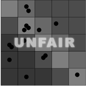
To help explain, allow me to ask: Are you color blind? I’m not. But 8% of men of Northern European ancestry are. How do you think they feel about being presented with charts that communicate loss exposure in colors? What if they can’t distinguish red and green? Are heat maps biased toward people who are gifted with being able to visually differentiate colors? It seems heat maps inherently discriminate against people who are colorblind. IS THAT FAIR? No!
The time has come for social justice in risk management. As an industry, we should no longer tolerate overt discrimination against people who are colorblind. Everyone, colorblind people included, deserves to be given equal opportunity to make well-informed risk decisions.
FAIR, the model that powers RiskLens, is an equal opportunity risk methodology. FAIR does not merely label the probable frequency and probable magnitude of future loss (AKA risk) with “red” “yellow” or “green” then put it in a box (e.g., one that is 3 x 3 or 5 x 5). Instead, the FAIR methodology quantifies and communicates risk a medium everyone with sight can see: dollars and cents.
Translating risk into dollars and cents not only helps those who are colorblind, it also helps bridge the communication chasm that is often found between InfoSec/Cyber Rockstars and the Board. Communication based on creating fear, uncertainty and doubt are not constructive means of helping an organization effectively manage risk. FAIR closes the communication gap by translating risk into the universal language of business: money.
Not only does FAIR foster inclusivity for people who are colorblind and non-techy, it also recognizes the diversity of loss exposure. Besides, risk comes in all frequencies and magnitudes, doesn’t it? FAIR celebrates risk diversity by producing results that forecast the distribution of both the probability of adverse events and estimated monetary impact.
I don’t care if you are colorblind or not, Analyst or Director, CISO or Board Member… can we all just agree that all should have an equal opportunity to make well-informed risk management decisions? If we can all agree, then let’s rebel against heat maps and start quantifying risk!
But seriously...
I hope this post captured your attention and highlighted (with humor) some serious deficiencies of the most commonly used communication tool in cyber risk assessments. Its flaws have been well-documented elsewhere.
For instance, Douglas Hubbard – the respected author of How to Measure Anything – argues that it perpetuates the worst tendencies of risk analysts: over-confidence, inconsistency, and inability to think in terms of probabilities. A scientific paper The Risk of Using Risk Matrices examines "how RMs produce arbitrary decisions and risk-management actions. These problems cannot be overcome because they are inherent in the structure of RMs." And for a thorough look from a practitioner's perspective of risk heat maps in action (or inaction), read this post from the FAIR Institute blog: Heat Maps Don't Support ISO 31000. -- TS
Related: