
Have you ever looked at the results in a RiskLens risk analysis and wondered what's the probability that a loss will hit the max? Or looked at the results and tried to answer how much risk you are comfortable with? If so, the new Loss Exceedance Charts introduced in RiskLens 2.2.7 are your answer.
What Is a Loss Exceedance Curve?
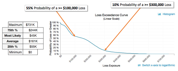
A loss exceedance curve is the output of a Loss Exceedance Chart (LEC) that helps businesses visualize the exceedance probability of a loss event. Like the Loss Exposure Histogram chart, LECs illustrate the results of applying Monte Carlo simulations to a FAIR risk analysis. Below is an example generated by the RiskLens platform.
Reading a Loss Exceedance Chart
The x-axis plots the annualized loss exposure for the given risk scenario considered in the analysis. The y-axis plots the probability of a loss being greater than the intersection with the x-axis, from 0 to 100%.
The RiskLens platform calculates Probability of Loss from the results of the Monte Carlo simulations. It does this by analyzing the range of results and finding the percent of values that are greater than or equal to segments of the range.
Using Loss Exceedance Charts to Make Business Decisions
The chart above represents annualized loss exposure between $0 and $731K. As a decision maker, how do you know what to plan for? What can this data tell you? Loss Exceedance Charts guide you to decisions by asking how comfortable your business is with potential loss.
You can start by asking questions such as, “What is the probability that the loss will be greater than $100K?” The LEC can be quickly used to determine that the probability is 55%. Are you comfortable with a 50/50 probability of loss being greater than $100K? Maybe you are, but what about something bigger?
What about greater than $300K? Your business might not be comfortable with this large of an amount. The probability is 10%. Is a 1 in 10 possibility of losses being greater than $300K worth the risk?
Using the RiskLens platform’s exceedance probability curves gives you concrete, financial data to refer to during the risk assessment process. By tying possible outcomes to costs, you can easily discuss our organization’s risk appetite with all of your key decision makers in a language they all understand.
Next Steps
This process helps you determine your organization’s comfort level of loss, given a risk scenario. If you're not comfortable with the level and probability of a particular loss, then you know it’s time to start addressing what risk mitigation techniques can help lower the exposure. Loss exceedance probability curves and charts are designed to help you decide where you need risk mitigation and how much of it you need to invest in to prevent a disaster; they play a key part in making good risk decisions.
Ready to start using the FAIR standard to address your risks? Schedule a demo to see if the RiskLens platform is right for you.
Related: RiskLens Case Study: Which Cybersecurity Solution Delivers the ROI?
What Does RiskLens Reporting Tell Me?
Product Update: RiskLens Adds New Features for Sharper Picture of Cyber Risk