 Many “cyber risk dashboards” are out on the market that will give you a numeric or color-coded rating, based on benchmarking your security program against the best practices in the NIST CSF or counting flaws in your defenses like number of open ports. RiskLens clients see through that, and stay focused on the definition of “risk” that truly counts in business: loss exposure in financial terms.
Here’s RiskLens Risk Consultant Erin Macuga’s report on how the RiskLens team helped one client generate a true top risks dashboard worthy of taking to the board.
The Challenge
An organization within the healthcare industry was having difficulty effectively communicating their cyber risk exposure to leadership and the Board. In order to bridge this gap, they were asked to create a cyber risk dashboard. The goal of the dashboard is to clearly articulate the top cyber risks and the exposure faced by the organization, including comparison of business units and their associated areas of risk.
The catch was that the dashboard had to be completed and have a draft of it presentable to leadership within a two-week timeframe. The good news was that the risk team was already well along in utilizing the RiskLens platform to quantify their cyber risk exposure based on the FAIR™ model.
The Solution
Upon arriving onsite, RiskLens talked to subject matter experts (SMEs) to establish what was being done to communicate cyber risk to leadership in a comprehensible format. It was determined that prior to the project, the organization had outlined their top ten cyber risk themes and the associated risks within each. However, when it came to communication there were bits and pieces being communicated about cyber but there was no collectively exhaustive list that was cyber only.
While looking at the figures, we found that some of the themes lacked sufficient data to be clearly defined on the dashboard, while others could be easily combined into another predefined category to provide more comprehensive definitions of what the topics were comprised of in each theme. With that in mind, we went through the themes again and were able to reduce our list from ten themes to five themes.
After clearly defining the themes, we were able to use a feature within RiskLens called data helpers. This feature allows the user to increase consistency and efficiency by gathering data that is reusable across many analyses. Using data helpers, we were able to define answers to specific questions within the platform based on the associated theme. Then, when new data is obtained for a theme, the associated data helper could be updated to reflect that change which would then trigger all related analyses to update as well. This allows the organization to save time by not having to update analyses individually – and forms the engine of a dashboard.
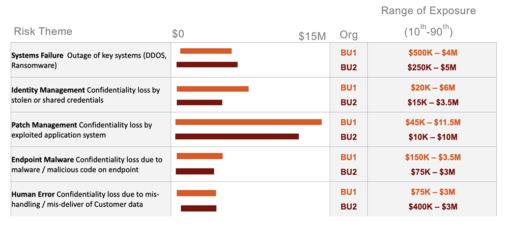
The business has a second company that is part of the parent organization. Because a clear and repeatable process was outlined for how to evaluate and aggregate cyber risks, the same process was applied to this second company to see how the top themes compared against each other. Following the completion of the analyses for both business units, a dashboard was created to show the comparison. 
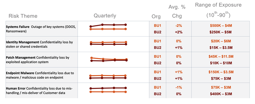
The above dashboard captures the five themes that were established and the range of exposure of each cyber risk theme for each organization, as well as, how the two organizations compare to each other. Using the structure of this dashboard, we then created a second dashboard containing a trend line to show the differences over each quarter or year.  These dashboards will be utilized for presentations to leadership and then to the organization’s board to demonstrate the top cyber risks within the company. Additionally, the trend line dashboard will be employed to show how the mitigation efforts are helping to improve their readiness to combat these cyber risks.
Due to the organization of the cyber risk themes and associated data helpers, once the dashboards were complete, we were able to quickly conduct a future state analysis to see how implementing a new control would reduce the risk for a particular threat. The result of the analysis showed the economic value of executing the new protective measure by determining the amount of resulting risk reduction with the project.
The dashboard will be continuously updated to not only represent each cyber risk theme the organization faces but to articulate how each business unit plays a role in the company.
Key Takeaways
The use of a cyber risk dashboard enabled the organization to understand and compare their top cyber risks across each theme. In doing so, it allowed them to determine what their focus should be and if their mitigation strategies for their top risks are reducing risk and better protecting the organization. The data libraries in the RiskLens platform enabled the ability to continuously update analyses without starting over as well as showing any changes over time.
By partnering with RiskLens, running analyses that they can modify, and creating this dashboard, they can now clearly articulate what risks they are seeing each quarter and what measures should be taken for a risk reduction.